A flat logo can do the job, but it rarely feels memorable. If you’re sourcing branded apparel for a uniform program, retail merch, or corporate gifting, embossed and debossed printing (embossing raises the mark while debossing presses it in) can add the kind of tactile finish people notice without needing loud graphics.
On garments, both change how the logo catches light, how it creates a tactile experience under a hand, and how it gives the piece a premium look at close range.
By the end of this guide, you’ll know which finish fits your brand style, which fabrics tend to show texture best, what detail limits to expect, and how to start with samples so approvals feel calm instead of risky.
Key Takeaways
-
- Embossing raises the logo for a more noticeable 3D texture, debossing presses the logo in for a cleaner, subtle mark.
- Fabric controls the result, stable knits, cotton fleece, and French terry show texture better than thin or highly stretchy fabrics.
- Simplified artwork holds up best, thick strokes and bold shapes stay readable, tiny text and fine lines can soften or fill in.
- Heat, pressure, and tooling must match the garment, so approving a physical sample (ideally wash-tested) is the fastest way to set expectations.
- Some emboss or deboss methods can add stiffness or reduce stretch in the logo area, so placement and comfort checks matter, especially on uniforms.
Table of Contents
What You Need To Know Right Away Before You Pick A Raised Or Pressed Look
How Embossed And Debossed Printing Actually Works On Apparel Materials
Why This Finish Wins When You Want Premium Apparel Branding Without Loud Graphics
How To Compare Embossed And Debossed Printing Against Other Apparel Decoration Methods
Getting Started Without Headaches: What To Send, What To Approve, And What To Test
Pro Tips From The Production Floor For Cleaner Logos And Longer-Lasting Texture
A Real-World Order Story: From Sample To Confident Rollout On Apparel
Design Rules That Make Embossed And Debossed Printing Look Expensive On Fabric
Placement Choices That Change Everything On Apparel: Chest, Sleeve, Back, And Beyond
Frequently Asked Questions About Embossed and Debossed Printing for Apparel
The Top Buyer Worries About Embossed And Debossed Apparel, Answered
What You Need To Know Right Away Before You Pick A Raised Or Pressed Look
Embossed and debossed logos don’t “print” like ink, they change the surface of the fabric. Under overhead light, embossing throws a soft shadow and looks more dimensional as a raised image. Debossing shows up as a cleaner contour with a sunken effect, like the fabric was gently stamped.
The hand feel is the tell. Embossed logos usually feel lifted and structured. Debossed logos feel like a shallow impression, often smoother to the touch.
Expect the fabric to decide a lot for you. A lofty cotton fleece can hold shape like memory foam. A slick nylon shell can rebound fast and soften the mark. That’s why the same die and logo can look sharp on one hoodie and faint on another.

Tone on tone embossed logo on the front of a premium hoodie
Quick Answer: Which One Fits Your Brand, Embossed Or Debossed?
If you want a quiet, modern mark, debossing fits tone-on-tone branding on athleisure and corporate uniforms. Blind deboss is a good match when you don’t want the logo to dominate from across the room.
If you want a more “touch me” finish, embossing suits streetwear, heavier hoodies, and outerwear where texture can stand up to daily wear. Blind embossing also photographs well in angled light for product pages.
For high-wash items (facility uniforms, team gear), choose the option that stays visible even when the fabric relaxes, which usually means bolder shapes and a fabric with good recovery.
How Embossed And Debossed Printing Actually Works On Apparel Materials
Most apparel embossing and debossing comes down to heat and pressure from a shaped tool (often a custom die or metal die). Using a male die and female die with a counterdie, the garment gets pressed so fibers compress into a raised or recessed form. Some methods add a film or transfer to hold the shape longer and improve contrast.
Results change by material:
- Cotton fleece and French terry usually show the clearest texture because the surface has body.
- Performance polyester can look crisp, but it can also “spring back,” so testing is key.
- Nylon shells can show a clean stamp, yet the mark may soften as the fabric flexes.
- Blended knits vary a lot, even when they feel similar by hand.
Samples aren’t optional for confident approvals, they’re the proof.
See Also: Embossing on T Shirts: How to Elevate Your Apparel Brand or Bulk Order with 3D Style
What You Get In Real Life: Texture, Readability, And Brand Impact
Up close, these finishes signal care. People run a thumb across the mark, the same way they touch a raised seal on packaging. That tactile moment is where perceived quality jumps.
From a distance, readability depends on lighting and logo geometry. A bold icon or thick wordmark holds its shape. Hairline details can fade because fabric fibers round off edges.
For ecommerce photos, embossing and debossing can look subtle in flat lighting. Angled shots, side light, and close-ups usually show the depth best, so plan your product photography around that.
Your Options On Garments: 3D Puff, Heat Press, Emboss Films, And Combo Finishes
Vendors may offer several pathways that land in the “raised or pressed” family. A heat press emboss can form texture directly into the fabric. Emboss films (often tone-on-tone) can add contrast and help the mark stay defined. Puff ink can mimic a raised feel, but it behaves more like a print layer than a true pressed texture.
Each choice changes the garment:
- Hand feel: films can feel smoother or slightly firmer than the base knit.
- Stretch: thicker layers can reduce stretch right on the logo.
- Breathability: transfers can block airflow in that spot, which matters on performance polos.
Many teams ask for a simple comparison table (method vs best fabrics vs look vs durability notes) when narrowing options.

Debossed emblem on a performance polyester athletic shirt worn by a model.
Why This Finish Wins When You Want Premium Apparel Branding Without Loud Graphics
The embossing and debossing print finish earns its keep when you want branding that feels intentional, not shouty. Texture lets you shrink the logo and still make it feel “designed,” like the tactile cues in luxury packaging, because the surface change does the talking.
For uniform programs, it keeps teams looking polished without big ink panels that can crack, feel heavy, or fight with dress codes. For merch, it can make a simple hoodie feel like a higher tier item, even in a single color.
It also helps when you want one garment to work for workdays and weekends. A subtle mark gets worn more often, which is the whole point of branded apparel.
Where It Shines: Uniforms, Team Gear, Retail Merch, And Corporate Gifting
Picture Maya at Ridgeway Logistics ordering winter layers for drivers and warehouse leads. She picks midweight hoodies in a dark heather, then chooses debossing for a left-chest mark so it looks professional under a safety vest and still feels premium in hand.
A boutique gym chain does the opposite. They choose embossing for a back-neck hit on black French terry, tone-on-tone, so members notice the texture when they pull on the hoodie.
For corporate gifting, beanies and fleece quarter-zips work well because the fabrics hold shape, and the branding stays tasteful.

Matching hoodies and beanies featuring embossed and debossed logos.
How To Compare Embossed And Debossed Printing Against Other Apparel Decoration Methods
If your team is weighing decoration options, focus on how the mark affects comfort and wear, not just how it looks on a mockup. Emboss and deboss finishes add almost no thread bulk, and they can feel lighter than a dense screen print or a thick patch.
They also rely less on color contrast. That’s great for subtle branding, but it can be a downside if you need high visibility on dark garments in low light, unlike foil stamping which offers a reflective shine in such conditions.
Ask one practical question: does the garment need to stretch and breathe like a training top, or sit structured like a work hoodie? That answer narrows the best method fast.
What Sets It Apart From Embroidery, Screen Print, And Heat Transfers
Embroidery adds texture, but it can feel heavy and stiff on lighter knits, and small placements can pucker. Screen print can stay sharp, yet large ink areas may feel warm or rubbery on fleece. Standard heat transfers can pop in color, but they can look like a sticker if the film edge is noticeable.
Unlike letterpress printing commonly used for stationery, embossing and debossing sit in a sweet spot for tone-on-tone branding. They can fall short on tiny text, ultra-thin tees, and fabrics that don’t hold a pressed shape.
Quick Answer: Which One Fits Your Brand, Embossed Or Debossed?
| Decision Factor | Embossed Printing | Debossed Printing |
|---|---|---|
| Visual Effect | Raised logo with visible depth and shadow | Recessed logo pressed into the fabric surface |
| Overall Look | Bolder, more dimensional, more tactile | Cleaner, quieter, more understated |
| Best For Brand Style | Streetwear, premium merch, statement pieces | Corporate uniforms, athleisure, subtle branding |
| Hand Feel | Lifted and structured, easy to feel by touch | Smooth with a shallow indentation |
| Best Fabrics | Cotton fleece, French terry, heavyweight knits | Cotton fleece, French terry, stable polyester |
| Performance Polyester Behavior | Can look defined but may soften as fabric rebounds | Often cleaner than embossing, but depth can relax |
| Fine Detail Handling | Fine lines can soften or round off | Fine lines can fill in if pressed too lightly |
| Best Logo Types | Bold crests, icons, thick wordmarks | Simplified marks, minimal icons, solid text |
| Visibility From Distance | Better visibility due to shadow and lift | Best viewed up close or in angled lighting |
| Comfort Impact | Slight structure in logo area, varies by method | Typically lower profile and more flexible |
| Durability Over Time | Holds well on stable fabrics, may relax on stretch zones | Holds well but can flatten slightly with wear |
| Photography Impact | Photographs well with angled or side lighting | Needs thoughtful lighting to show contour |
| Common Use Cases | Hoodies, sweatshirts, outerwear, retail merch | Uniforms, performance wear, corporate gifting |
| Risk Factors | Too much pressure can stiffen the area | Too little pressure can make logo hard to see |
| Approval Requirement | Physical sample strongly recommended | Physical sample mandatory for confidence |
See Also: Custom Embossed & Debossed Tees and Hoodies
Getting Started Without Headaches: What To Send, What To Approve, And What To Test
Start with clarity, not guesswork. Send the logo in vector format, confirm placement (left chest, sleeve, upper back), and share the exact garment style and fabric content. Then approve a physical sample before any larger run.
Plan approvals in stages: artwork proof, sample press, then production. During sample review, check three things: edge sharpness, comfort (scratchy or stiff spots), and visibility in normal indoor light.
If the order spans multiple sizes, confirm how the logo scales. A mark that looks perfect on a medium can feel oversized on a small or disappear on a 3XL if the placement shifts.
What Your Vendor Will Need From You: Artwork, Fabric Details, And Finish Goals
Be ready with your vector art, brand guidelines, and any “do not modify” rules. Share fabric composition, garment colorways, and where the apparel will be worn (athleisure, jobsite, front desk).
Describe the finish goal in plain words: soft hand, crisp edge, subtle stamp, or a more raised feel for multi-level logo textures. Tooling and press settings vary by fabric, so a custom die or other physical components can be selected correctly; this detail prevents rework and keeps the sample aligned with your expectations.
Pro Tips From The Production Floor For Cleaner Logos And Longer-Lasting Texture
Good results start with design choices that respect fabric, particularly for embossing and debossing. Thick strokes, simplified icons, and generous spacing stay readable. Very thin lines can soften because knit fibers round and recover.
Placement matters as much as pressure. Keep the logo away from bulky seams, pocket edges, zipper tape, and ribbing when you can. Those areas press unevenly and can distort the shape.
Also watch stacked layers. A hoodie with a facing, lining, or heavy pocket bag can change how the press hits the outer shell, even at the same settings, which impacts the print finish.
What To Watch For So Your Logo Stays Sharp After Washing And Wear
Texture holds best when the fabric rebounds well. High-stretch zones (elbows, side panels, rib cuffs) can relax the mark faster than stable chest panels. Heat-sensitive fabrics also need careful testing so the surface doesn’t get shiny or warped.
Before you approve, run a simple check: feel the logo for stiffness, stretch the area gently, wash and dry once the way your team will, then re-check edge clarity and visibility under indoor light.
A Real-World Order Story: From Sample To Confident Rollout On Apparel
A buyer at a mid-size company orders hoodies and quarter-zips for five locations. The brand wants a premium feel without a big graphic. The shortlist comes down to embossing a chest logo or debossing a sleeve mark.
They approve two samples on the actual garments, not a random blank. One sample with embossing looks bold but feels too structured on the quarter-zip. The other sample with debossing looks subtle but clean. The team picks the finish that stays comfortable across both styles, then standardizes placement to keep sizing consistent.
How Ridgeway Outdoor Co. Landed A Premium Feel On Hoodies Without Changing Their Logo
Ridgeway Outdoor Co. chooses a midweight cotton-poly fleece hoodie with a smooth face. They keep placement classic, left chest, and go tone-on-tone so the mark feels upscale.
On the first sample, the thinnest parts of their logo soften. They thicken a few strokes and open tight gaps, then re-sample. After a quick wash test, the texture still reads in side light with a subtle 3D effect, and the hand feel stays soft enough for all-day wear.
Design Rules That Make Embossed And Debossed Printing Look Expensive On Fabric
The best artwork for embossing and debossing is confident and simple. Think bold crests that create a raised image, solid icons, and wordmarks with enough weight to hold an edge. If your logo has tiny taglines, plan a version without them for apparel.
Contrast can come from texture, not color. Matte fabrics often show the contour cleanly. Some films, like metallic foil, can add a slight sheen difference, which helps tone-on-tone marks show up on dark garments. A combination emboss pairs texture with other visual elements for added impact.
Also plan for size scaling. A left-chest mark needs different spacing than a full back hit. Build two or three approved logo sizes so buyers aren’t guessing per style.
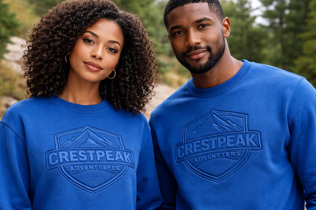
Royal blue sweatshirts featuring a bold, tone on tone embossed crest logo.
Placement Choices That Change Everything On Apparel: Chest, Sleeve, Back, And Beyond
Left chest is popular because it’s stable, easy to align, and offers strong visual impact up close. Sleeves feel modern and work well for subtle debossing, but they live in stretch zones and can distort on smaller sizes. Upper back can look premium on outerwear for techniques like embossing, though hoods and collars can cast shadows that hide detail.
Construction details matter. Seams, pockets, zippers, and ribbing create pressure gaps. If you need the mark near a pocket, shift it slightly so the press sits flat. Consistency comes from measured placement guides, not “eyeballing it” across sizes.
How Fabric Stretch And Garment Construction Can Make Or Break The Final Look
Rib cuffs, side panels, hood seams, and kangaroo pocket edges are the usual trouble spots because thickness changes fast across a small area. Stretch panels can also pull the logo out of square when worn.
Plan around these zones. Choose flatter panels, keep a safe margin from seam lines, and avoid placing detailed logos on highly elastic areas. When you must decorate near structure, ask for a sample on that exact placement so you can see real distortion before approval.
Frequently Asked Questions About Embossed and Debossed Printing for Apparel
What’s the difference between embossed and debossed printing on apparel?
Embossing raises the logo above the fabric surface, so it reads stronger in touch and shadow. Debossing presses the logo into the fabric, so it looks more understated and clean. Both rely on changing the fabric surface instead of adding ink.
What fabrics work best for embossed and debossed logos?
Cotton fleece and French terry usually show the clearest texture and hold it well. Heavier blended knits can also work, but results vary. Thin jersey, loose knits, and highly stretchy areas tend to soften the edges and reduce visibility.
Does embossing or debossing last after washing?
It can last well on stable fabrics, but some softening over time is normal. Longevity depends on fabric recovery, artwork thickness, and wash habits. The safest approval step is a physical sample that you wash and dry once using real care instructions.
Will an embossed or debossed logo show on dark colors?
Often yes, but visibility depends on surface texture, sheen, and lighting. Tone-on-tone logos can disappear in flat light, so confirm with angled photos and a physical sample in the exact color and fabric.
Does embossed or debossed branding affect comfort and stretch?
It can, especially when films or thicker transfer layers are used to hold shape. The logo area may feel firmer and stretch less than the base fabric. Test placements on high-movement zones (like sleeves and ribbing) before approving production.
The Top Buyer Worries About Embossed And Debossed Apparel, Answered
Will the texture flatten after washing?
It might soften, and that doesn’t mean the finish failed. Fabrics relax over time, especially knits. Approve a sample only after one wash and dry cycle that matches how your team will care for the garments.
Will the logo show up on our fabric and color?
Visibility depends on surface texture, sheen, and lighting. A smooth fleece face can show crisp edges, while a pebbled knit can hide detail. Ask for photo proofs in angled light, then confirm with a physical sample in the exact colorway.
Will it feel stiff or uncomfortable?
Most discomfort comes from added films, thick layers, or placements in high-flex areas. Keep logos on flatter panels, avoid large coverage, and choose a softer finish goal when the garment is worn against skin.
If you want branded apparel that people actually wear, texture is a smart place to start. Embossed and debossed printing gives you a premium look without relying on big ink coverage or bright colors, but it only shines when the fabric and artwork are chosen with care.
Unlike embossing wedding invitations or debossing business cards on paper stock and cardstock, where a durable metal die creates permanent impressions, apparel finishes account for fabric stretch and wear. Send your vendor a vector logo, the exact garment style, and a short note on the feel you want (subtle stamp, crisp edge, or more raised). Then request a couple of samples on your real blanks and approve after a quick wash check. If you’re deciding between embossing and debossing, a side-by-side sample is often the fastest way to get internal buy-in, especially since these techniques differ from paper stock applications.
Share your artwork and garment shortlist by email or phone, and ask what they recommend for your fabric and placement goals.
If you want to get started with your custom Emboss or Deboss garments, give us a call (908) 806-8337 or fill out the quote form and we’ll call you!